|
|
How important are fonts in user interface and user experience design? We have the answers in a monster edition of Expert Lists authored by type expert Johannes López Ayala. Here are the 16 font families he recommends for use in modern UI/UX design: |
|
|
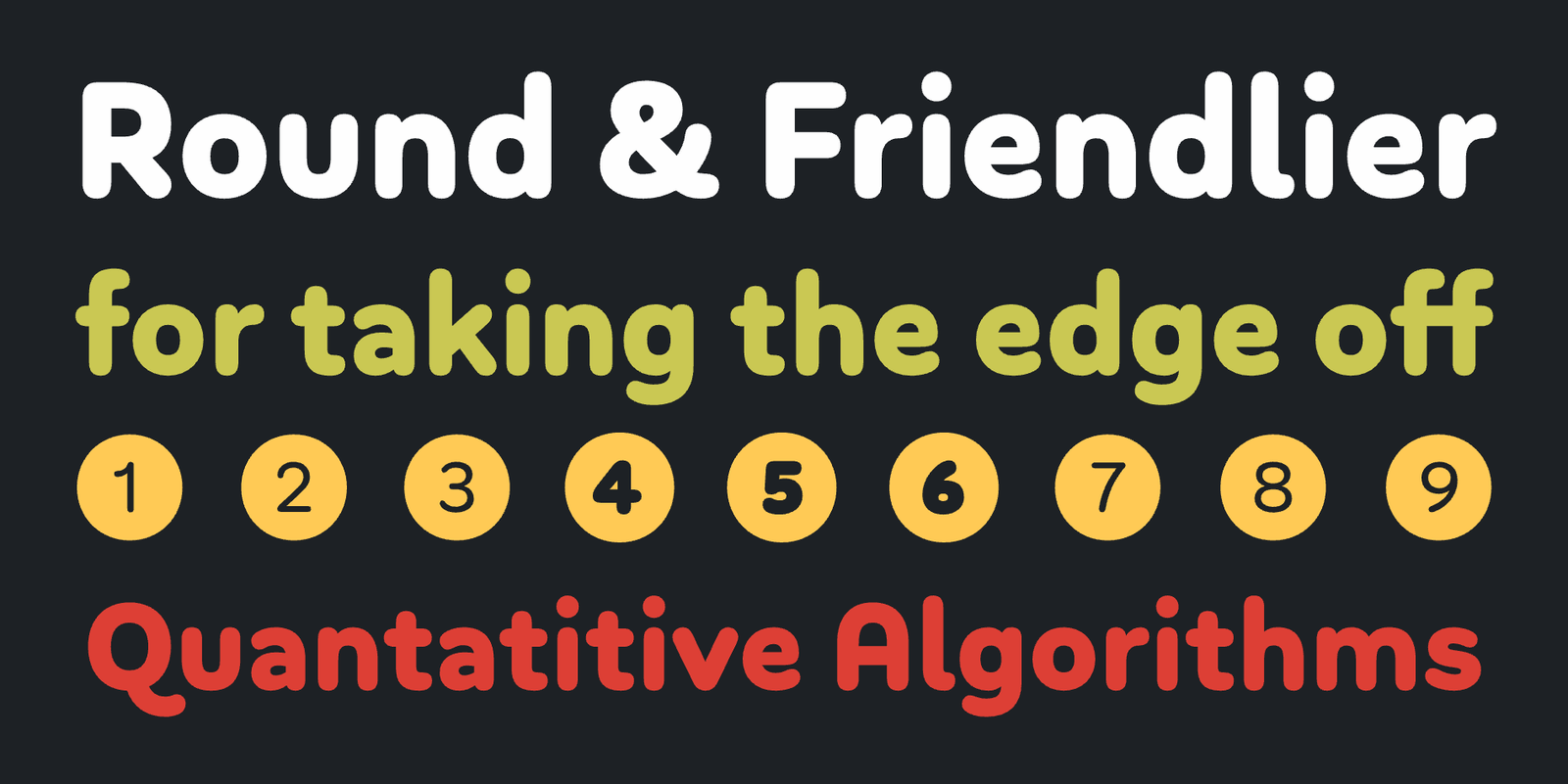
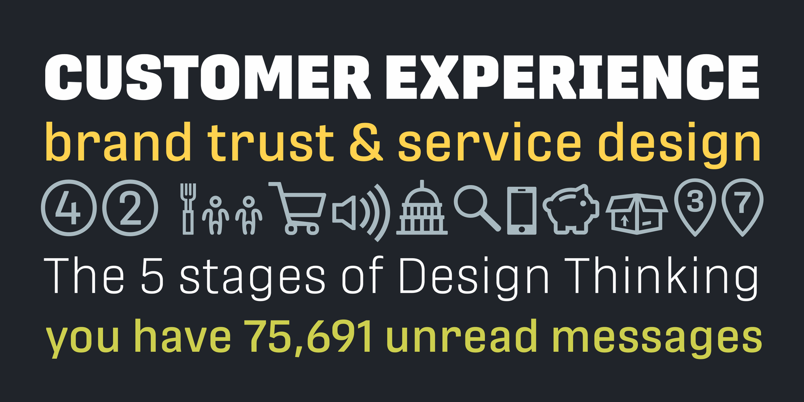
by Hannes von Döhren / HvD Fonts
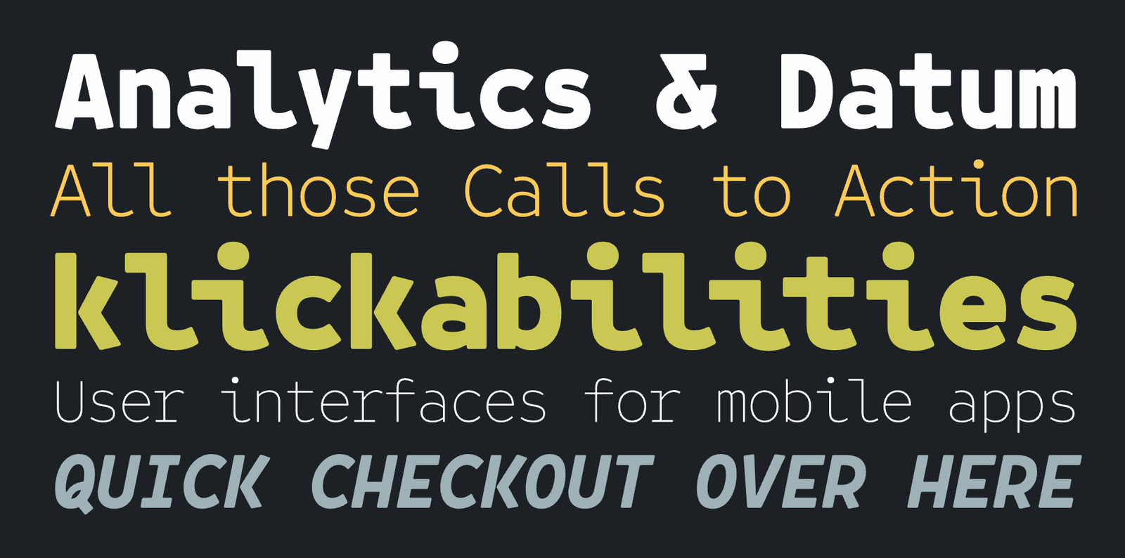
Apps that want to communicate in an informal and friendly manner often resort to rounded typefaces. This isn’t a bad idea: the soft look of fonts from this genre can make for a benign and safe mood if used right.
‘Soft’ and ‘Round’ can be regarded as two different genres, with Soft typefaces honing corners to a small radius and Round ones topping the entire stroke width with a circle segment. Not all foundries adhere to this naming convention, though. Bouba Round is an excellent example from the Round genre with smooth curves all over, remaining legible even in small sizes.
|
|
|
|
|
|
|
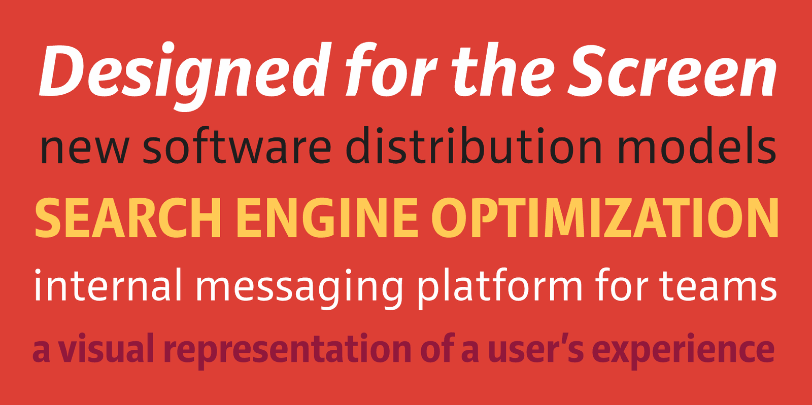
by Radomir Tinkov / Fontfabric
Muller Narrow is a space-saving variant of Muller. Like its wider counterpart, it is a versatile humanist typeface with a generally neutral yet slightly friendly appearance, spiced with a pinch of character. The typeface’s generous apertures, economic proportions, and wide range of weights make it a useful tool in UI/UX design for mobile devices. The Narrow family comes without Muller’s delightfully chunky ‘Fat’ weight, though.
|
|
|
|
|
|
|
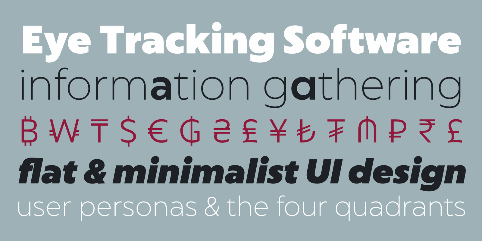
by Arne Freytag / Fontador
Darkmode was all the rage in late 2022 and early 2023 UI/UX design. By now, it’s a convention. It makes sense, though: negative typesetting (bright text on a dark background) spares your eyes from looking into a screaming white rectangle all night.
With darkmode, a nigh-forgotten truism of typography had to be rediscovered by many designers: in negative typesetting (especially if backlit), type has to be lighter because it appears optically bolder than usual. Adrian Frutiger knew this when designing his famous Charles de Gaulle airport signage.
You don’t have to design your own type like Frutiger to achieve impeccable negative typesetting, though. Arne Freytag’s Whiteblack supplies you with the right tool to pull it off easily—each weight comes in a positive and a negative variant that will look equally bold when employed in their respective natural habitat.
|
|
|
|
|
|
|
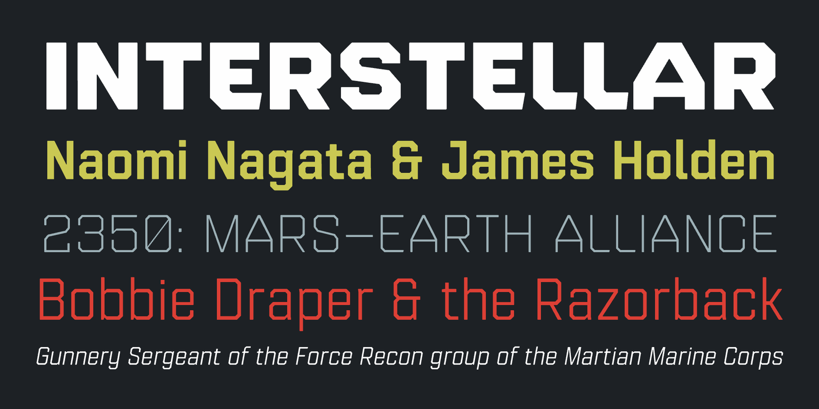
by Jonathan Hill / The Northern Block
Superellipses are, to put it simply, elliptical shapes with squarish curves. (Type designers refer to this as ‘high curve tension’.) Since the 1960s, when these typefaces were frequently used in science-fiction films (notably, Stanley Kubrick’s ‘2001’), they have been associated with high-tech applications and futuristic themes. With generous counters, this kind of glyph construction is well suited for digital displays, too. Jonathan Hill’s Paradroid is a suite of fonts that plays out the benefits of its genre while also providing an additional ‘mono’ subfamily for extra versatility in UI/UX design (see next entry).
|
|
|
|
|
|
|
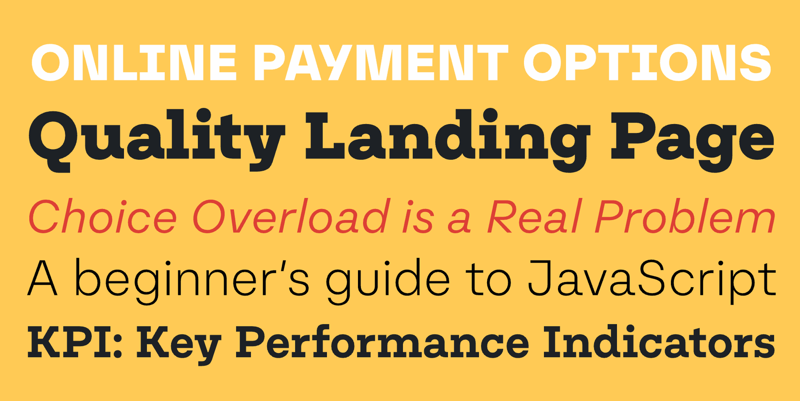
by Toshi Omagari / Tabular Type Foundry
Toshi Omagari—who happens to run two foundries named ‘TTF’ and ‘OTF’ simultaneously—has a knack for monotype typefaces. Also called non-proportional typefaces, these are a rather exotic choice for body copy. In the limited doses of text that most apps deal with, though, they can be a refreshing font choice. The letterforms of Belinksy are well suited to on-screen use.
|
|
|
|
|
|
|
by Dieter Hofrichter / Hoftype
Dieter Hofrichter’s typefaces look fantastic on digital screens. I’ve achieved stellar results with Hoftype fonts on e-ink displays in particular. Equip is a calm humanist typeface with a geometric heritage that looks crisp and clean in a pixel-based environment. It’s the ideal crystal goblet to pour any kind of content into, from indie messaging apps to big corporate communication.
|
|
|
|
|
|
|
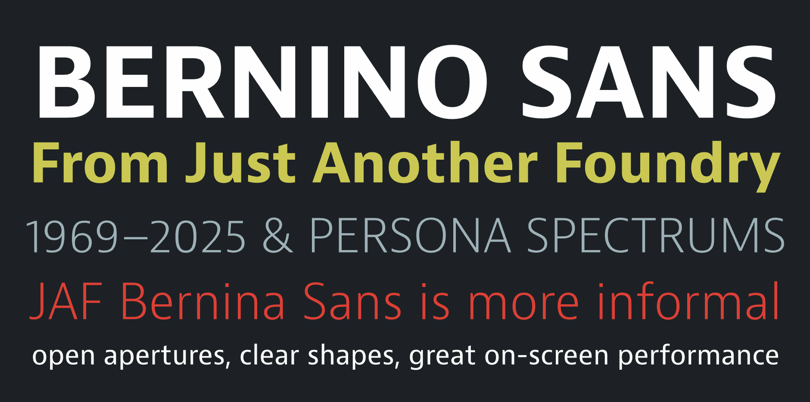
by Tim Ahrens & Shoko Mugikura / Just Another Foundry
Bernino Sans is part of the Bernini superfamily, which comprises Bernino & Bernina Sans. An extraordinarily legible, neutral yet soulful humanist sans, Bernino is the Frutiger of the 21st century. It features open apertures, clear shapes, great on-screen performance, and a wide range of weights and widths that come in handy when optimizing type for different screens and devices. Bernina is the less technical version of Bernino, with round dots and a triple-story ‘g’. It can be used to extend Bernino’s screen-based brand voice into the world of printed matter.
|
|
|
|
|
|
|
by Alanna Munro / Alanna Munro Type Design
Another example of superelliptic glyph construction, Alanna Munro’s Tofino superfamily is an entire suite for complex UI/UX projects. The original Tofino family comes in 4 widths and has neogrotesk-style closed apertures with vertical and horizontal stroke endings. Tofino Text opens the apertures a bit, adds diagonal stroke endings, and uses alternates (like ‘l’ with a hook) for better legibility in small sizes.
|
|
|
|
|
|
|
by Veronika Burian & José Scaglione / TypeTogether
TypeTogether’s Protipo is a DIN-like grotesque with flat sides. It’s not quite an engineers’ typeface, though: slightly angled stroke endings and a few alternates that move the obliques closer to a ‘true italic’ subtly infuse Protipo with soul. The Protipo superfamily was specifically created for information design. It even comes with an icon set in two weights.
|
|
|
|
|
|
|
|
|
|
|
by Anita Jürgeleit / TypeThis!Studio
Captura Now is my go-to Verdana alternative. Verdana is a legendary (though overexposed) typeface that found its way into the collection of the MoMA, but it was optimized for a type of device that has largely gone obsolete by now. For the time being, I’m happy to leave Verdana in the museum and resort to Anita Jürgeleit’s friendlier, more versatile, multiscript Captura Now. It looks clean and confident on contemporary high-resolution devices.
|
|
|
|
|
|
|
by Moritz Kleinsorge / Identity Letters
The Nomos superfamily balances two attributes that are often on opposite ends of the scale: neutral enough to adapt to any content, distinct enough to provide a unique brand language. The ‘brutalist’ construction principle ensures that both Sans and Slab appear crisp on small and large screens. I can see Nomos being used in a banking app just as well as in an underground techno radio or a gardening forum—it’s that adaptable.
|
|
|
|
|
|
|
by Ludwig Übele / Ludwig Type
A neutral humanist sans, Ludwig Übele’s Riga is narrow enough to be economical and wide enough not to be regarded as narrow. While not exactly generous, its open letterforms are wonderfully legible in text sizes and fine print while the bolder weights pack a punch in headlines. The original Riga already offers stellar screen performance and it has always been more than sufficient for my design needs. However, there’s also Riga Screen, a four-font suite derived from Riga that is optimized specifically for e-ink and mobile device displays. Riga Screen is a bit lighter and wider than Riga. The two families can be combined easily.
|
|
|
|
|
|
|
by Kimmy Kirkwood / Kimmy Design Co
While I can see Refinery mostly in the realm of computer games, the range of styles in this typeface (a whopping 84 fonts) gives you ample opportunity to use the limited space of a hand-held device to full capacity. Its squarish, mechanical structure lends itself to low-resolution screens.
|
|
|
|
|
|
|
by Felix Braden / Floodfonts
Let’s talk about Futura for a bit. Paul Renner’s 1927 classic is part of the world’s typographic heritage and it’s here to stay. Yet, it’s fundamentally a print typeface that doesn’t feel at home in UI/UX settings. Compare any letterpress-printed Futura specimen to any Futura-laden website or app and you know what I mean. It was a boon to UI/UX designers everywhere when Felix Braden released his Capitana font family. While loosely based on Futura, it ironed out so many irregularities and pumped up the x-height so vigorously that it became a design in its own right, rooted in our time. Capitana is eye candy on mobile screens. It’s so legible I even use it in fine print as a Futura replacement.
|
|
|
|
|
|
|
by René Bieder / Studio René Bieder
Faktum is a neo-grotesk sans-serif typeface with a geometric silhouette and squarish counters, giving it a ‘technoid’ but very distinct look and conveying a poised brand voice in contemporary UI/UX design. Due to this construction, the counters are more open than in your generic grot. This can aid legibility on screen. On the other hand, Faktum’s peculiar shapes leads to a fair amount of stroke contrast and its closed apertures might increase ambiguity between letters in small sizes, so tread with care. Faktum comes in 8 weights and 4 widths, the condensed of which make for efficient headlines and titles. Only the normal width has italics.
|
|
|
|
|
|
|
by Lisa Schultz / Schriftlabor
Apart from its formidable Name, Lisa Schultz’s Bajazzo also excels as a UI/UX typeface. Despite its wood-type origin, the clean rendering of humanist curves, the range of 9 weights and 3 widths (also available as a multi-axis variable font), and the multiscript language support bestow Bajazzo with incredible on-screen versatility. A few signature characters like ‘W’ and available alternates like a Star Wars-style ‘R’ allow for effective typographic branding in larger sizes.
|
|
|
|
|
|
|
|
|
|
|
|
|
|
|
|
|