US · ilovetypography.com

🏆 Steven Heller’s Font of the Month: Puffery

I Love Typography x Steven Heller


This email was sent

Is this your brand on Milled? Claim it.

Store | Blog | Academy

Steven Heller’s Font of the Month:
Puffery by Nick Shinn

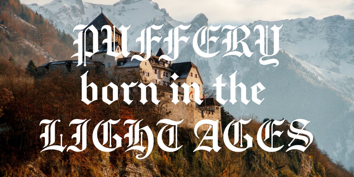
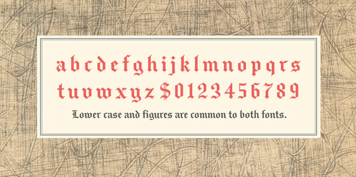
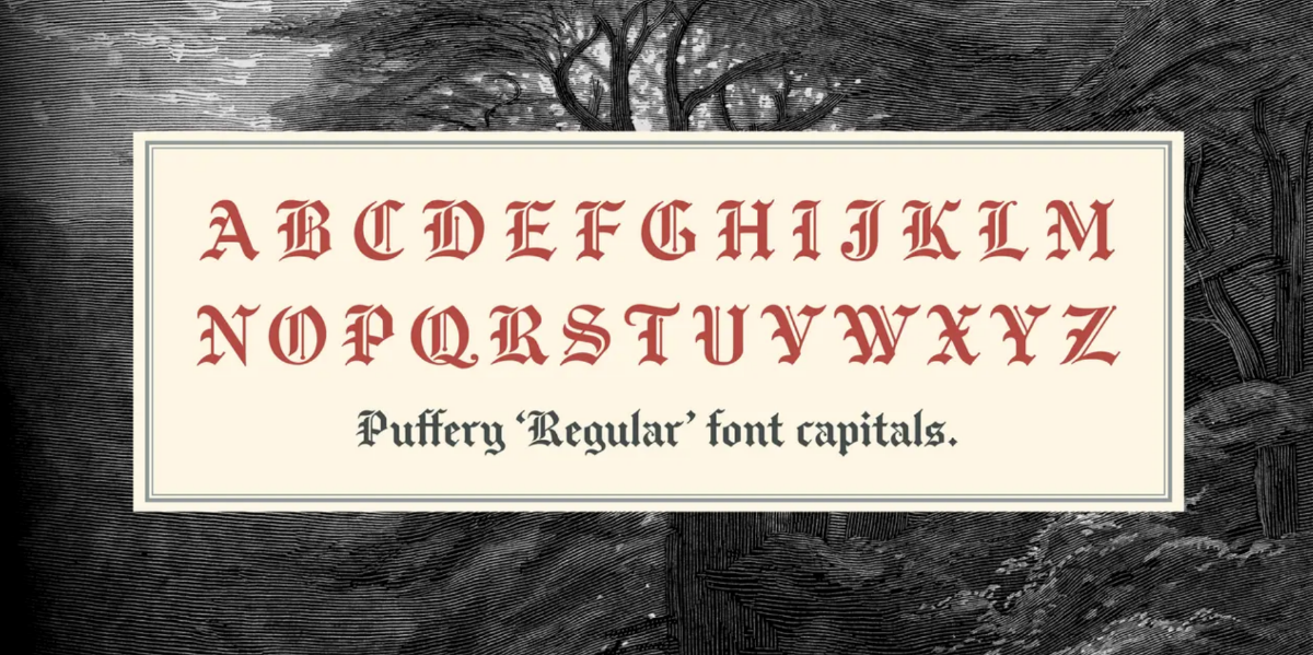
Sometimes I get a hankering to see someone use a good old Blackletter, spikey Fraktur, or rounded Textura that transports me back to medieval Europe when a printer’s digital handiwork was created with ten fingers. That Blackletter was anathema to the later movements of Modern European designers and typographers, so to use it in 2026 suggests a certain rebelliousness. As a calligraphic typeface used to print Gutenberg’s Mainz Bible and almost all the other ecclesiastic tracks that followed, it has a moldy Germanic presence, and its adoption as the Volk, or official people’s face, of the Third Reich does not add much in the way of positivity to its symbolism. Yet a typeface can only be exorcized for so long. Despite its various applications as the nameplate for countless international newspapers past and present, Blackletter (also known as Old English) in its various forms and styles has long been a kind of forbidden fruit of typography . . . difficult to read because of its curvy, swirly, decorative excesses. Nonetheless, it has a long history and a healthy legacy, and when applied correctly, the juxtaposition of caps and lowercase letters is extremely artful.

A recently designed version, aptly called Puffery by its creator Nick Shinn, is an agreeable typeface – not for everything in this AI age – but it looks pretty damn good on posters, book jackets, record covers, logos, and just about anything else that does not demand the visual signal for ultra-modernity.

It comes in two capital options with a common lower case: Puffery Regular and Puffery Vintage Capitals. The distinction between these two is subtle but noticeable. Take the “E”: It is angular in Regular and curvilinear in Vintage. Similarly, the “M”s have the same differences; the “T”s are tweaked, and generally the vintage version is an iota more noodled.

This is a moment in history – a quarter of a century into the twenty-first century – wherein certain old-fashioned artifacts are being reappreciated. Just maybe as AI is entering the type design and typography universe, new language models (LLMs) are being introduced to show more interest in the oldest typographic languages. It’s not as if Blackletter entirely disappeared since World War II, but perhaps the time has come for a revival and rebirth, and the exotic Puffery is among the early inklings of a newly dusted-off Blackletter’s aesthetic charm. 


Read more of Steven’s Font of the Month in our archive.
 
GET PUFFERY
Copyright © 2026, I Love Typography Ltd, all rights reserved.

Our mailing address is:
Suite 1, First floor, 1 Duchess Street, London, W1W 6AN

You can update your preferences or unsubscribe from this list.

Are you sure?

Lists help you organize the brands that you care about. Your lists are private to you.