Hallå -,
Just a few years ago, I assumed we had almost everything we ever needed from CSS. But CSS keeps evolving, becoming richer and more advanced. This newsletter is dedicated to just that! Useful CSS techniques, new CSS features, and a few helpful little strategies to make CSS clean and lean. We hope you’ll find it useful!
While most folks tend to agree that digital sustainability is an important topic, it is also difficult to see what we (as individual contributors) can do to make a difference ourselves. Join in on our upcoming Smashing Meets Sustainability online session, where we’ll share a few hours of knowledge, inspiration, and practical learning!
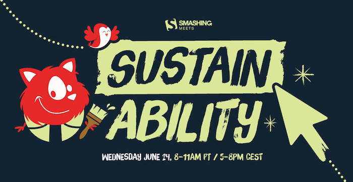
Join three leading sustainability experts on Wednesday, June 24 at 8–11 AM PDT 🌍. Tickets are free for our community, so why not join and spread the love! Get your ticket →
We are getting ready for SmashingConf Antwerp 2026 🇧🇪, our conference on design & UX, for designers and UI engineers who love the web. Also coming up are online workshops — a friendly way to learn practical, actionable insights from experts:

Free online workshop coming up on June 9 — see you there?
And now let’s dive into the wonderful world of CSS tools and techniques, everyone! We hope you’ll find them useful!
— Vitaly
1. Conditional Validation with nth
Doing a cursory check on user input controls is a great way to cut down on submission mistakes and help users make sure they have met certain requirements before they submit a form — for example, that they have filled out a required number of form fields. Preethi Sam explains how n of selectors can help with conditional validation.
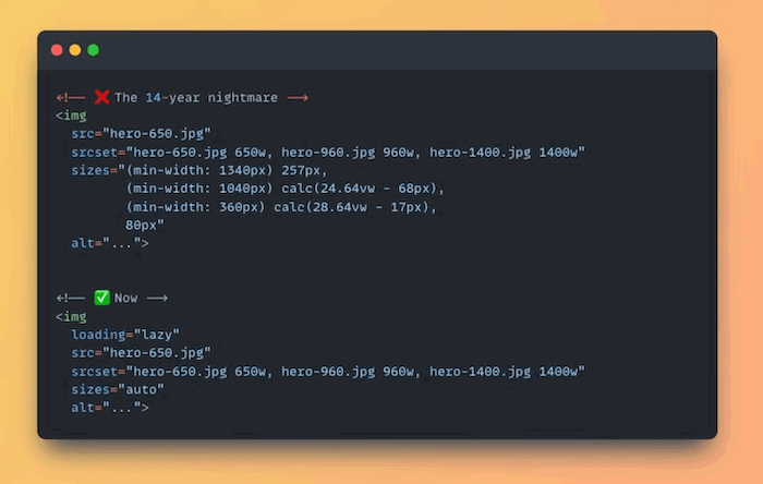
2. New Responsive Image CSS
Describing sizes for responsive images has always been frustrating, but, good news, those days are finally over. With the help of loading="lazy" and the new sizes="auto", the browser can determine the best size for an image on its own. There’s one exception, though: hero images. Since they shouldn’t be lazy-loaded, they still require a real size value.
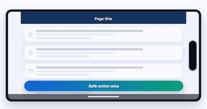
3. Mobile-Safe Layouts
Camera punch holes, notches, dynamic islands, home indicator bars — how can we make sure that important content and controls aren’t obscured by the system UI? Safe area insets adapt the layout to the current device’s safe area to prevent bugs. They are baseline widely available and can be used in production today.
From our sponsor

ProtoPie AI turns a simple prompt into a fully interactive prototype with triggers, variables, and animations in minutes. Watch the recorded live demo and see it for yourself.
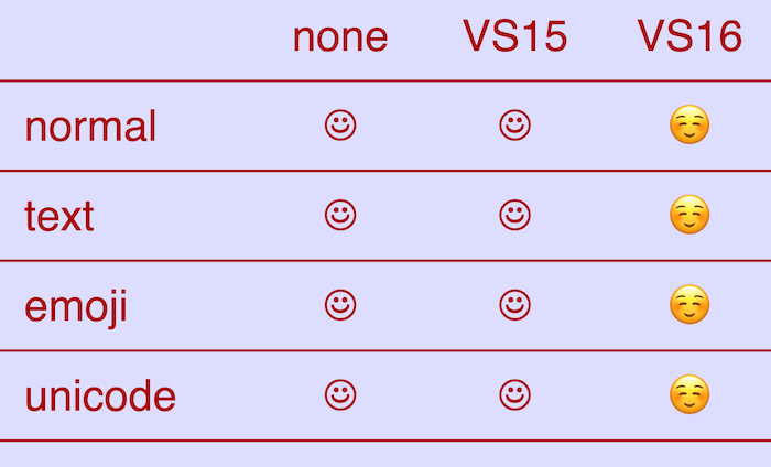
4. Unicode Variation Selectors
Have you heard of font-variant-emoji yet? The CSS property specifies whether an emoji is displayed in the full-color variant or as monochromatic text. To help ensure you always get the desired result, Matthias Zöchling tested the impact different values of font-variant-emoji have on how an emoji is displayed.
5. Container Query Typography Systems
When using breakpoint-based typography scales, you might run into issues where the scale doesn’t behave as expected. For example, when you have a two-column layout with an image on one side and content on the other. Container-based queries solve that. They allow your typography to respond to the size of the parent container rather than the entire viewport.
6. CSS Multi-Column
Multi-column layouts come with a downside: Once content exceeds a limit, it forces a horizontal scroll. To prevent this from happening, Chrome 145 introduced the column-height and column-wrap properties. They wrap the additional content into a new row below, creating a vertical scroll instead of a horizontal scroll. Abhishek Pratap Singh explores how the new properties compare to CSS Grid, Flexbox, and the evolving CSS Masonry.
From our sponsor
Introducing The Video Generator From Shutterstock GenAI

A handy helper when you need a quick video for a prototype, pitch, or placeholder: Shutterstock GenAI helps you turn ideas into a polished clip in minutes — useful for storyboarding and rapid iteration. Comes with two free generations to try it out.
7. CSS Subgrid
If you’ve ever wrestled with CMS-driven layouts, you’ll love CSS subgrid. Subgrid allows child elements to inherit the parent grid. This enables you to create complex block patterns and then use subgrid to align their contents back inside. No repetitive nested wrappers, no negative margin hacks. David Bushell’s guide helps you get started.
8. Accessible UX Research, Now Shipping 📚
We’ve got exciting news! Our newest Smashing book, Accessible UX Research by Michele A. Williams, is finally shipping worldwide! Get the book right away or order the eBook for instant download.
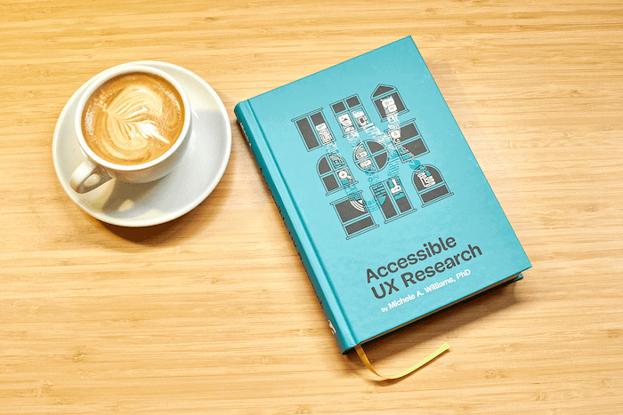
Meet our brand-new book: “Accessible UX Research” by Michele A. Williams. Printed copies shipping now.
Accessible UX Research is your practical guide to making UX research more inclusive of participants with different needs — from planning and recruiting to facilitation, asking better questions, avoiding bias, and building trust. Download a free sample (PDF, 2.3MB) or get the book right away.
9. Upcoming Workshops and Conferences
That’s right! We run online workshops on frontend and design, be it accessibility, performance, or design patterns. In fact, we have a couple of workshops coming up soon, and we thought that, you know, you might want to join in as well.
With online workshops, we aim to give you the same experience and access to experts as in an in-person workshop from wherever you are.
As always, here’s a quick overview:
10. Person Of The Week: Donnie D’Amato
Please give a warm round of applause for our Person of the Week: Donnie D’Amato. Donnie is a Design Systems Architect with a background in UX design, front-end engineering, and higher education. He builds systems that aren’t just component libraries but strategic frameworks that help teams move smarter and faster.
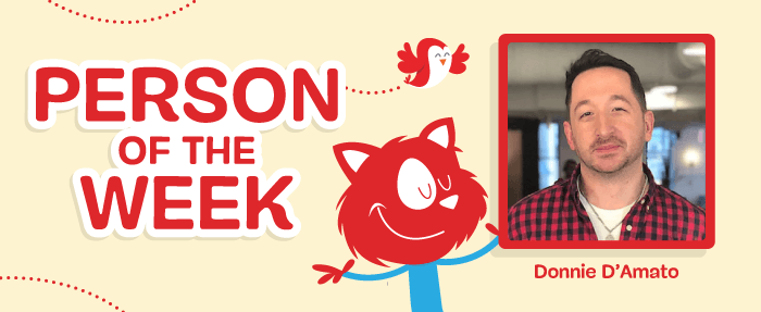
Passionate about sharing knowledge, Donnie has contributed to higher education through mentoring, teaching, and shaping curricula in UX and web technologies. He is also the author of the book Mise en Mode and host of Undefined, a New York-based live event about usability and best practices in tech.
Thank you for everything you do for the community, dear Donnie! 🧡
11. Recent Smashing Articles
That’s All, Folks!
Thank you so much for reading and for your support in helping us keep the web dev and design community strong with our newsletter. See you next time!
This newsletter issue was written and edited by Cosima Mielke, Vitaly Friedman, and Iris Lješnjanin.
Sent to truly smashing readers via Mailchimp.
We sincerely appreciate your kind support. You rock.
Follow us on Mastadon • Join us on Bluesky

